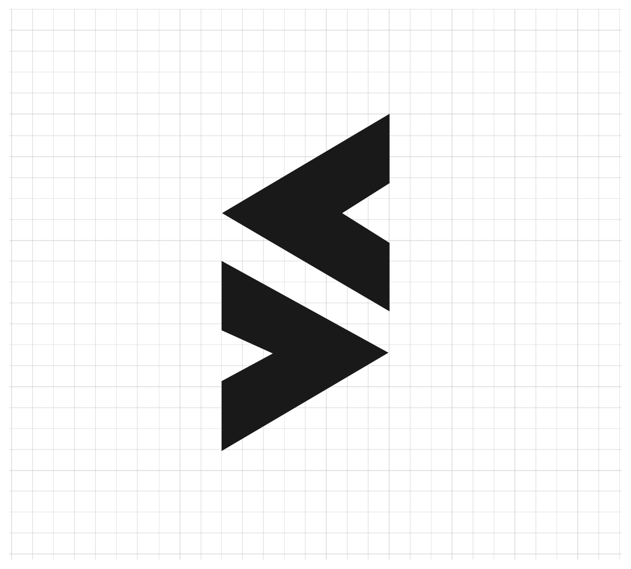
Simplicity - made out of just two simple arrows representing the key entities - customers and employees.
An interesting combination of the two, forms the letter ’S’, which represents Systems Valley. This symbolises that the close interaction of the two entities (customers + employees) shapes the organisation and its foundation.
The arrows example of motion and direction gives a hint of our expertise and decisiveness.
Very accurately placed together the two arrows are live example of symmetry, balance and transparency.
The left arrow gives us the opportunity of introspection whereas the right one shows what’s coming up next.
It coherently combines with the literals or the word mark giving a unique identity whereas the symbol itself can be used distinctively as a true image of the brand.
The top and bottom smooth edges of the arrow gives a detailed thought to bring in harmony, friendliness and approachability.
The interesting shadows gives the tangibility to the symbol and gives a stance among all other competitors.